
An occupancy heatmap is a booking-derived visual that shows which rooms and time slots are sold, underbooked or sitting idle. Built from your actual reservation data, not floor sensors, it turns a wall of numbers into a colour grid you can read in seconds. The immediate payoff: you spot exactly where staffing is misallocated and which slots need a price nudge or a promotion before the week is over.
Occupancy rate is the metric that decides whether an escape room turns a profit, and many venues run well below their real capacity without realising it. Riddlio is one example of a platform that surfaces this analysis directly from booking data, so operators don’t have to build spreadsheets to see it.
- Definition: a colour grid of rooms versus time slots, built from bookings
- Immediate use: find idle slots and staffing risk at a glance
- Core metric: occupancy rate drives revenue more than almost any other number
- Practical example: platforms like Riddlio expose this view automatically
Key takeaways
An occupancy heatmap turns booking data into staffing and pricing decisions, and venues that automate the response to it consistently fill more off-peak slots than those relying on manual review.
| Point | Details |
|---|---|
| Heatmap needs clean booking data | Room ID, session window, capacity, payment state and no-show flag must all feed the map. |
| Turnover buffer is non-negotiable | Skipping it overstates availability and causes delayed starts and staffing squeezes. |
| Staff and price to the pattern | Use gross-profit-per-shift staffing and dynamic pricing to match the colours, not a fixed roster. |
| Automate the recovery loop | Reminders and waitlist alerts refill cancellations fast instead of leaving cells pale. |
| Riddlio exposes this natively | Riddlio’s booking and analytics platform surfaces occupancy, utilisation and no-show data without a manual export. |
Table of Contents
- What data does an occupancy heatmap actually need?
- How do you read the colours on an occupancy heatmap?
- What should you do with heatmap insight?
- How do you build a heatmap from your booking system?
- What mistakes wreck a booking-derived heatmap?
- Why most escape room owners read their heatmap backwards
- Get your occupancy heatmap running without building it yourself
- Frequently asked questions
- Sources
What data does an occupancy heatmap actually need?
The map is only as good as the booking data feeding it. Get these fields wrong and you’ll be staffing for a Saturday that isn’t real.
- Room ID — each room is a distinct resource, never a shared calendar slot.
- Session start and end time — the actual booked window, not the advertised runtime.
- Capacity — minimum and maximum players per session.
- Booking type — public, private, corporate, or party.
- Payment and waiver status — confirmed versus pending versus tentative.
- No-show flag — did the group actually arrive?
From those raw fields you derive the numbers that matter: utilisation percentage (booked minutes divided by available minutes), effective availability once you subtract a realistic turnover buffer, and average group size per session. Run three checks before you trust any of it: confirm every timestamp uses one timezone, fix your reporting window (daily versus rolling seven days changes the picture completely), and decide upfront whether tentative or unpaid bookings count as occupied. Most venues that get burned here counted a “held” slot as sold.
How do you read the colours on an occupancy heatmap?
A good heatmap uses a simple three or four band legend: dark red for fully booked, orange for partial fill (one or two spots taken in a group room), pale yellow for low fill, and grey or white for genuinely empty. The colour tells you what to check next, not what to conclude outright.
Four patterns show up in almost every venue’s data:
- Peak corridors — Friday and Saturday evening slots run near capacity most weeks, often the only consistently dark cells on the grid.
- Weekday troughs — Tuesday and Wednesday afternoons sit pale for months at a time, a direct target for discounting or corporate outreach.
- Room-specific gaps — one room underperforms regardless of day, which usually points to theme fatigue or a pricing mismatch, not the calendar.
- Partial-fill slots — sessions booked at two out of six players, wasting capacity that a smaller add-on group could fill.
Pro Tip: Don’t read the heatmap alone. Sit it next to occupancy rate, no-show rate and average turnover time — a pale cell caused by cancellations needs a different fix to a pale cell that was never booked at all.
Industry data on escape-room profitability shows baseline occupancy commonly sits in the mid-teens to mid-thirties percent range for less mature venues, which means most of the grid you’re looking at has real room to improve.
What should you do with heatmap insight?
Reading the pattern is only half the job. Here’s what to actually change once the pale cells show up.
- Staff to launches, not hours. Use a gross-profit-per-shift calculation, divide your trailing daily gross profit by a target per-employee shift contribution, and place your best game masters at the actual launch times the heatmap shows are busiest, rather than spreading coverage evenly across the day.
- Discount the pale cells, not the dark ones. Off-peak pricing and flash promotions belong on Tuesday at 2pm, never on Saturday at 7pm. A dynamic pricing toggle that drops automatically for underbooked windows does this without manual price changes every week.
- Chase weekday demand deliberately. Corporate team-building outreach and gift-card pushes are reliable ways to fill Tuesday and Wednesday troughs that public bookings never touch on their own.
- Automate the recovery loop. Booking reminders, waitlist alerts and instant resale of cancelled slots are where the real occupancy gains show up. Vendors report 30 to 50 percent higher occupancy after adding automation and reminder sequences, largely by cutting no-shows and refilling cancellations within minutes instead of days.
The common thread: staffing decisions and pricing decisions should follow the map, not a fixed roster written months in advance.
How do you build a heatmap from your booking system?
Start with the staffing-by-demand approach and work backwards into your booking platform’s export or live feed.
- Pull the core fields (room ID, session window, capacity, booking type, payment state, no-show flag) directly from your booking calendar rather than reconciling separate spreadsheets.
- Set session rules once: each room as its own resource, a fixed session length, a realistic turnover buffer, and clear private-versus-mixed and waiver-gating logic so overlapping bookings can’t slip through.
- Choose your aggregation view. Hourly slots suit day-to-day staffing calls; rolling 7 and 30-day views suit pricing and promotion decisions. Set utilisation band thresholds (say, under 40% pale, over 80% dark) that match your own venue’s history.
- Automate the triggers that follow from the colours: reminders at booking, waitlist offers when a slot cancels, dynamic price drops on persistently pale cells, and a standing reporting cadence for owners.
- Run a two-week reconciliation after launch. Compare scheduled starts against actual starts, then adjust your turnover buffer and colour thresholds against what you actually observed.
Platforms built specifically for escape rooms, including Riddlio’s management suite, handle most of this natively rather than requiring a custom export pipeline.
| Step | What to check |
|---|---|
| Extract fields | Room ID, session window, capacity, payment state, no-show flag |
| Set session rules | Turnover buffer, private/mixed logic, waiver gating |
| Choose aggregation | Hourly for staffing, rolling 30-day for pricing |
| Automate triggers | Reminders, waitlist offers, price adjustments |
| Reconcile | Two-week check against actual starts, adjust thresholds |
What mistakes wreck a booking-derived heatmap?
Four mistakes show up again and again, and each one quietly inflates the map’s confidence.
- Hidden turnover time. Cleaning and reset between sessions rarely gets logged, so the heatmap overstates real availability and books staff into a squeeze they can’t win.
- Bad slot logic. Systems that allow overlapping bookings, or fail to release a resold cancellation, corrupt every colour on the grid downstream.
- Chasing single-day blips. One unusually quiet Tuesday isn’t a trend. Decide on trend windows before you touch pricing or staffing.
- Unfiltered tentative bookings. A pending or unpaid reservation counted as “sold” makes a genuinely empty slot look covered until the no-show hits.
Why most escape room owners read their heatmap backwards
The conventional advice treats an occupancy heatmap as a reporting tool, something you glance at monthly to feel informed. That’s backwards. The map’s real value is as a trigger list, not a report card. Every pale cell should generate an action within days, not a shrug at the end-of-month meeting.

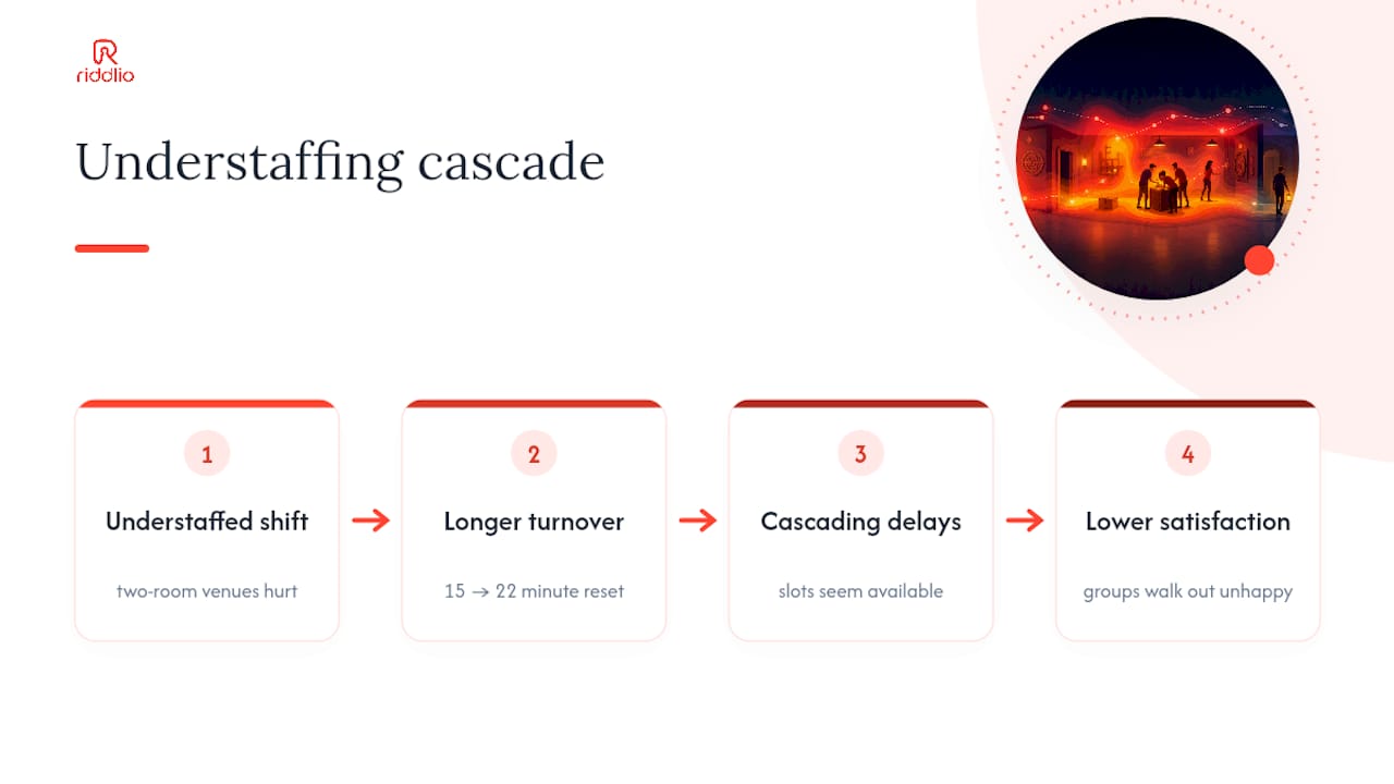
Where most operators go wrong is treating turnover time as a rounding error. It isn’t. A 15-minute reset window that actually takes 22 minutes doesn’t just delay one group, it cascades through the rest of the day and quietly convinces the heatmap that slots are available when they aren’t. Fix the buffer before you touch pricing or promotions, because every other decision downstream depends on it being right.
The other overlooked point: staffing by gross profit per shift feels like overkill for a two-room venue, but it’s precisely the venues with fewer rooms that can least afford a mismatched roster. Get the launch-time staffing right first. Pricing experiments and corporate outreach are worth far less if a Saturday launch is understaffed and the group walks out unhappy.
Get your occupancy heatmap running without building it yourself
Riddlio is the practical route to everything covered above, without the spreadsheet wrangling most venues attempt first. Instead of exporting bookings and building your own colour grid by hand, Riddlio surfaces occupancy, utilisation and no-show data straight from the same platform where you take bookings and payments.
That matters because the fields this article walks through, room ID, session windows, payment state, no-show flags, are exactly what Riddlio’s booking calendar already tracks. Add automated SMS reminders and dynamic pricing on top, and the pale cells this guide tells you to chase start filling themselves before you’ve had your morning coffee. If you’re running multiple rooms across a busy weekend and dead weekday afternoons, check out Riddlio’s booking system and see how it maps against your current setup.
Frequently asked questions
Is an occupancy heatmap the same as a sensor-based floor map? No. In this context it’s built entirely from booking data, room, time slot, capacity and payment status, not physical sensors tracking movement through a space.
How often should I update my heatmap? Daily for staffing decisions, and a rolling 30-day view for pricing and promotion calls. A single day’s data is too noisy to act on alone.
What occupancy rate should I be aiming for? There’s no universal target, but industry commentary on escape-room profitability shows plenty of venues operating well under 40%, so most rooms have real upside once off-peak slots start filling.
Can I build a heatmap without dedicated software? You can, using a spreadsheet pulling from your booking exports, but you’ll need to manually recalculate utilisation and turnover buffers every time volume changes. A purpose-built platform like Riddlio does this automatically.
Sources
- Escape Room Business Model: Revenue, Costs, and Profitability - LegalClarity
- AI for Escape Rooms: Automate Bookings, Marketing & Operations in 2026 | Bizzby
- Escape room booking software: Guide - SoftService
- How many employees should I schedule each shift at my escape room? - PulseRevOps