Fix mobile checkout friction, show rates before forcing a click into the booking flow, cut form fields, and remove forced account creation. Those four changes account for most of the fast, measurable gains venues see. Add tokenised payments like Apple Pay and Google Pay, then track your funnel stage by stage so you know which fix to run next.
TL;DR:
- Showing prices and rates early filters out less serious shoppers and reduces abandonment before entering the booking flow.
- Mobile booking workflows should prioritize thumbs-friendly design, fast load times, and accepting digital wallets to improve completion rates.
- Displaying taxes, fees, and member discounts on the initial rate screen prevents surprises that cause last-minute cancellations.
- Placing reviews and testimonials next to the booking widget builds trust at the critical hesitation point and increases conversion.
- Focus first on improving the booking engine and mobile flow, especially if your site-wide conversion is below 1.5 percent, before optimizing other elements.
Table of Contents
- What actually moves your booking conversion rate
- What KPIs actually tell you where the leak is
- Fixing the booking widget for phones
- Pricing and payment choices that stop late abandonment
- Where to put the widget and what it should say
- A 30-day audit, then a longer testing plan
- Why Riddlio maps directly to this playbook
- Segmentation and personalisation that lift booking intent
- Using urgency and scarcity without looking desperate
- Reviews and testimonials placed where they actually change a decision
- Turning the post-booking screen into extra revenue
- Author perspective: which fixes to prioritise for a small team
- Turn these fixes into a system with Riddlio
- Sources
- FAQ
What actually moves your booking conversion rate
Most conversion advice buries the useful bit under generic tips. Here’s the ranked version, starting with what tends to pay off fastest.
- Cut the booking form to essentials. Name, email, phone, payment. Everything else — company name, “how did you hear about us,” a second address line — is a reason for someone to bail. Support browser autofill so returning visitors barely type at all.
- Make guest checkout the default. Requiring account creation before checkout significantly increases abandonment, and there’s no good reason to force it. Let people book first, create an account after if they want one.
- Show price ranges and a rate calendar before the booking flow starts. Nobody wants to hand over an email address to discover the price. Surface it early and you filter out the price shoppers before they clog your funnel.
- Add tokenised payments. Tokenised payment methods and prebuilt checkout flows reduce friction and materially lift completion, particularly on mobile where typing a card number is genuinely painful.
- Use adaptive, specific error messages and inline validation. Generic errors slow recovery and push people to abandon; a message that says exactly what’s wrong and where gets people back on track in seconds.
- Fix the hero photos and shorten the description. The image and the first line of copy decide whether someone clicks into the booking widget at all; see how to increase booking conversions with better photos. A blurry photo or a wall of text loses people before they ever reach a form.
- Add abandoned-booking recovery emails with a follow-up link. Someone who got halfway through and stopped is a warmer lead than any new visitor. A single follow-up email with a direct link back to their cart recovers a chunk of that lost revenue for free.
Pro Tip: Run the numbers on your current form first. Count every field, every click, every screen between “see rates” and “confirmed.” If it’s more than four steps, you’ve found your first fix before reading another word of advice.
What KPIs actually tell you where the leak is
Track four numbers, not one. Visitor-to-booking rate is your site-wide conversion, sessions to confirmed bookings. Booking-engine conversion measures only the people who reached your booking widget, and it’s typically 3 to 5 times higher than your site-wide rate — which tells you the biggest lever is often just getting more visitors to click into the booking engine in the first place, not fixing the engine itself. Quote-to-booking rate tracks people who saw a price and didn’t finish. Funnel completion rate shows where inside the booking flow people drop.
For benchmarks, independent accommodation sites typically convert visitors at 1.5% to 2.5% site-wide, with mobile running noticeably below desktop.
- Segment every metric by acquisition channel (organic, paid, direct, OTA referral) and by device.
- Check your booking-widget initiation rate separately from payment completion. A gap between the two flags a mid-funnel problem, not an entry problem.
- If mobile initiation is healthy but mobile completion lags, the leak is in your payment step, not your marketing.
Fixing the booking widget for phones
Design the widget for thumbs, not cursors. Collapse the room and rate selection into a single screen instead of forcing three taps to see a price, and make every button big enough to hit without zooming in.
- Accept Apple Pay and Google Pay so mobile visitors skip manual card entry entirely.
- Test the flow on a real phone over 3G and 4G, not just Wi-Fi in your office. Every extra second of load time can cut conversion by roughly 7%, and that penalty hits mobile hardest.
- Avoid third-party iframes for your booking widget where possible. They’re a common cause of broken conversion tracking and slower load times, and you can’t fix what you can’t measure.
Pro Tip: Book a test slot on your own site using your phone’s mobile data, away from wifi, once a month. It’s the fastest way to catch a broken flow before a paying guest does.
Pricing and payment choices that stop late abandonment
Show taxes, resort fees, and cleaning fees on the same screen as the room rate, not at the final payment step. A surprise cost at the last screen is one of the most common reasons people abandon after they’ve already committed mentally to booking.
- Offer at least two familiar payment methods plus one low-friction option like a digital wallet.
- Use member-only or email-gated rates. This shifts demand from OTAs back to direct bookings when your rate parity agreements allow it, and it gives you a legitimate reason to show a “you’re saving X” figure.
- Put a security badge and a one-line cancellation summary right next to your booking CTA, not buried in a separate policy page.
Where to put the widget and what it should say
Keep the booking widget above the fold on every page that matters, not just the homepage. Someone landing on a room description page from a Google search shouldn’t have to scroll to find a way to book.
- Write microcopy that sets clear expectations: does clicking “Book Now” capture payment immediately, or just start a request? Say so before the click, not after.
- Add a visible progress indicator once someone’s inside the flow. Three dots showing “step 2 of 3” reduces the anxiety that causes people to close the tab.
- Place three to five short, specific reviews next to the widget, not a generic star rating with no context.
- Show the member rate next to the public rate with the saving spelled out. A crossed-out higher price next to a lower one does more for urgency than any countdown timer.
A 30-day audit, then a longer testing plan
- Week one: audit page speed, mobile flow, rate visibility, and widget initiation rate.
- Weeks two to four: ship the quick wins. Guest checkout, tokenised payments, and visible rates typically produce a lift within weeks rather than months, based on documented case patterns from checkout fixes.
- Months two to twelve: run one variable at a time, keep an experiment log with dates and sample sizes, and don’t call a result until you’ve got enough bookings to trust it.
Pro Tip: Before you run any test, build a simple checkout health view. FullStory recommends this exact approach: watch real sessions to find where people actually stall, then fix that stage first instead of guessing.
Why Riddlio maps directly to this playbook
Some booking and management platforms combine booking, payment processing, and analytics in one system to serve escape room and immersive venues. That matters because most of the fixes above depend on seeing your funnel clearly rather than guessing.
Automated SMS and email reminders reduce no-shows without extra staff effort, and real-time analytics show which slots convert and which stall. A white-label booking widget can help venues apply placement and microcopy principles without building a custom booking flow from scratch.
Segmentation and personalisation that lift booking intent
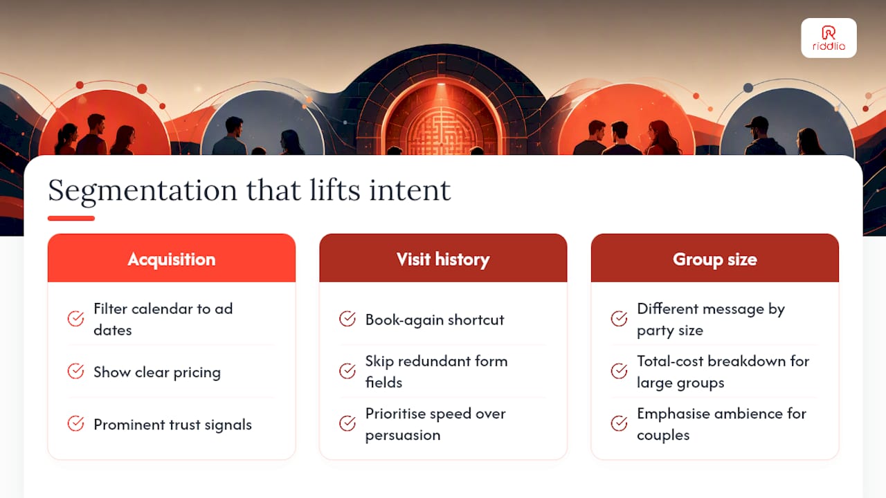
Not every visitor to your booking page is the same person with the same intent, and treating them identically leaves conversion on the table. A first-time visitor from a Google search needs trust signals and clear pricing. A returning customer who booked six months ago needs speed, not persuasion.
Segment your booking experience by three simple factors: acquisition source, visit history, and group size. Someone arriving from a paid ad chasing a specific date range should land straight on a calendar filtered to that window, not a generic homepage. Someone who’s booked before should see a “book again” shortcut that skips redundant form fields, since you already hold their details.
Group size matters more in hospitality and experience bookings than most operators treat it. A party of two and a party of ten have different questions. Larger groups care about total cost breakdown and whether the booking can be adjusted later; couples care about ambience and availability speed. Surface a different message or a different upsell prompt depending on party size selected early in the flow, and you’re speaking to the actual decision each visitor is making.
Time-of-day and day-of-week patterns are worth watching too. If your data shows weekday bookings skew toward local repeat customers and weekend bookings skew toward first-time tourists, the copy and trust signals each group needs on the same page probably shouldn’t be identical. A platform with real-time analytics makes this kind of segmentation practical rather than theoretical, because you can see the pattern instead of assuming it.
Using urgency and scarcity without looking desperate
Scarcity works because it’s true, not because it’s decorated. A countdown timer on a rate that never actually expires trains visitors to ignore every future urgency cue on your site, and once that trust breaks, it doesn’t come back.
Real scarcity in accommodation and experience bookings usually comes from two honest sources: limited slots and limited-time pricing. If a Saturday evening slot has three spots left, say exactly that, “3 spots remaining,” rather than a vague “filling fast” that a visitor can’t verify. Specific numbers read as credible; vague urgency reads as marketing.
Limited-time offers work best when they’re tied to a real reason. A shoulder-season discount that expires at the end of the month is believable because seasons actually end. A “sale ends in 4 hours” banner that resets every time someone reloads the page is the fastest way to lose the trust you need for every other conversion tactic on this page to work.
Pair scarcity with the member-rate approach covered earlier. A visitor who sees a public rate, a lower member rate, and a note that only a few slots remain at that rate has three separate reasons to book now instead of coming back later, and none of them require a gimmick.
Reviews and testimonials placed where they actually change a decision
A five-star badge sitting in your footer does almost nothing. Reviews only earn their conversion value when they show up at the exact moment someone is deciding whether to trust you, which is usually right before they commit to paying.
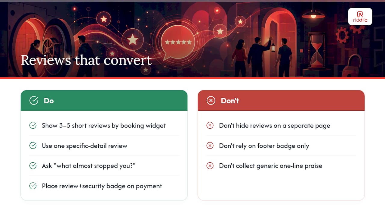
Place three to five short, specific reviews next to the booking widget itself, not on a separate testimonials page nobody visits. A review that says “the booking process was quick and the staff were ready for us when we arrived” answers the two questions a nervous first-time visitor actually has: will this be easy, and will it be what I expected?
Specificity beats volume. A single review mentioning a detail, a particular room, a staff member’s name, a specific date, reads as real in a way that a generic “great experience, 5 stars” never does. If you’re gathering new reviews, ask a direct question afterward, like “what almost stopped you from booking,” and you’ll often get the exact objection language you need to address earlier in your funnel.
Reviews also belong at the point of hesitation, not just the point of entry. If your data shows people stall on the payment screen, a small trust element there, a review plus a security badge, addresses the hesitation at the moment it’s happening rather than three screens earlier where it’s already been forgotten.
Turning the post-booking screen into extra revenue
The confirmation screen is the highest-attention moment in your entire funnel, and most venues waste it on a plain “thanks, see you soon” message. Someone who just paid is in a completely different mindset than someone still deciding, they’ve already committed, which makes this the easiest upsell moment you have.
Offer one or two relevant add-ons immediately after payment confirms, not before. A photo package, a gift voucher for a future visit, or an upgrade to a longer session works better here than earlier in the flow, where it would have added friction to a decision that wasn’t made yet.
Keep the upsell list short. One well-matched offer converts better than five options that force a comparison decision on someone who just wants their confirmation email. If your booking platform supports gift voucher sales, the post-confirmation screen is a strong place to surface a “buy one for a friend” prompt, since the customer is already primed with a positive experience in mind.
Cross-sell through the reminder messages too. An SMS reminder sent two days before the visit is a natural, non-pushy spot to mention parking details, a photo add-on, or a nearby partner offer, since the customer is actively thinking about the visit at that point rather than being interrupted mid-decision.
Author perspective: which fixes to prioritise for a small team
If your site-wide conversion sits under 1.5%, start with the booking engine and mobile flow before touching anything else. That gap between site-wide and booking-engine conversion is usually where the real money is hiding. If mobile completion specifically lags desktop, tokenised payments and speed fixes come first. Beyond that, run two to four small experiments a quarter and treat conversion work as an ongoing operational habit, not a one-off project.
— Iosif Beraru
Turn these fixes into a system with Riddlio
Every tactic in this guide, guest checkout, tokenised payments, visible rates, reminder emails, works better when one platform handles the booking, the payment, and the follow up together instead of three disconnected tools. Riddlio was built for escape room and immersive venues specifically, which means the booking calendar already reflects the single-screen, mobile-first design this guide recommends, rather than a generic hotel engine retrofitted for a different business.
Automated SMS and email reminders cut down the no-shows that quietly erode your booking-engine conversion, and dynamic pricing lets you apply the member-rate and urgency tactics above without manual spreadsheet work. Payment processing through Stripe, Square, and PayPal covers the tokenised wallet and multiple-payment-method advice from earlier sections in one setup.
If you’re ready to see where your current booking flow is leaking revenue, check out the online booking calendar and book a walkthrough to see it against your own venue’s numbers.
Sources
- Checkout UX best practices — Baymard Institute
- How to increase checkout conversion — Stripe Resources
- Hotel direct booking conversion 2026: The website playbook — Prostay
FAQ
How can I improve my conversion rates?
Start by cutting form fields, making guest checkout the default, and showing rates before the booking flow starts. Then add tokenised payments and track your funnel by stage so you know which fix to test next, using a platform like Riddlio to keep booking, payment, and reminder data in one view.
Is a 20% conversion rate good?
For a site-wide visitor-to-booking metric, 20% would be exceptional. It’s more realistic as a booking-engine conversion figure, since that number runs 3 to 5 times higher than site-wide conversion once someone has already reached your booking widget.
Is 2.5% a good conversion rate?
Yes, for site-wide visitor-to-booking conversion, 2.5% sits at the strong end of what independent accommodation and venue sites typically achieve, which usually runs between 1.5% and 2.5%.
Is a 12% conversion rate good?
A 12% conversion rate would be unusually high for a site-wide metric but plausible for a narrower stage, like quote-to-booking among visitors who already saw a specific price. Always check which funnel stage the number describes before judging it.